2021 Colors of the Year
3
Looking to refresh a room with new paint color? Design professionals and color enthusiasts in general eagerly await the annual announcements of Paint Colors of the Year, as determined by various painting and color authorities. Not surprisingly, the influence of the COVID-19 pandemic has extended to these choices by companies like Benjamin Moore, Valspar, Sherwin-Williams, Behr, and Farrow & Ball, to name just a few.
With the uncertainty of the times and the change in lifestyle that brought so many of us closer to home, paint colors and palettes for 2021 reflect the importance of calm and comfort. In describing their choices for 2021, paint manufacturers are using words and phrases like “deeply soothing” (Benjamin Moore), “comfort and safety” (Valspar), “optimism,” “warming,” and “resilience” (Pantone). The right paint color can be an antidote to troubled times, a relief from the stress of 2020. Let’s find out what the 2021 colors of the year are.
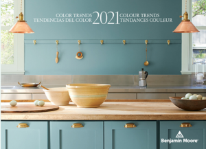
The importance of home and hearth this year cannot be underestimated. In introducing its Color Trends 2021 palette on its website, Benjamin Moore encourages us to “savor the small moments” and “celebrate the simple pleasures—think the faded rumple of linen sheets in the morning and perfectly ripened fruits on the windowsill.”
PPG
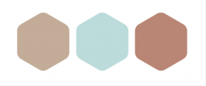
PPG calls its color palette for the new year “Be Well,” which consists of three evocative hues: Transcend, a warm beige, Big Cypress, a “comforting” ginger brown, and Misty Aqua, fresh contrast to the two earthy tones. “With the world sheltering in place for the better half of the year, we have begun to crave human connection and embrace simple activities, including walking, hiking, biking, and gardening,” said Dee Schlotter, PPG senior color marketing manager, architectural and industrial coatings. “This organic and hopeful palette represents what we have been longing for after decades of overstimulation and overconsumption–simplicity and restfulness.”
Behr
The Behr Color Trends 2021 Palette features 21 colors “to elevate your comfort zone,” in categories such as “Casual Comfort” (light, warm neutrals), “Calm Zone” (restorative blues and greens), “Subtle Focus” (soft, gentle hues), “Quiet Haven” (rich, evocative colors), and “Optimistic View” (bold and saturated). Valspar’s palette of 12 Colors of the Year includes “Morning Blossom” (a light, muted yellow), “Spiced Latte” (a warm, neutral beige), and “Succulent” (a light sage green), which Valspar Color Marketing Manager Sue Kim describes as “soft and simple, setting our mind at ease.” And HGTV Home by Sherwin-Williams has chosen Passionate HGSW2032, a “rich, saturated red” that conveys a “sense of comfort and confidence.”
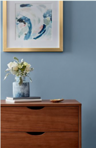
Britain-based Farrow & Ball chose 12 shades for its 2021 color trends that are meant to “convey a sense of ease and familiarity,” categorized in four groups, including “Rich and Warm” and “Natural Greens.” Glidden has selected Aqua Fiesta (PPG1147-4) as the Accent Color of the Year for 2021. Aqua Fiesta is a cheerful and fresh aquamarine. “No one could have predicted how upsetting 2020 would have turned out to be,” said Amy Donato, Glidden’s color whisperer. Now, it’s time to put down that homemade banana bread and pick up a paintbrush.”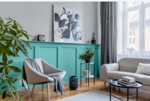
Pantone
Pantone, the global color authority known for its Pantone Matching System (PMS), chose two colors, 17-5104 Ultimate Gray and 13-0647 Illuminating (a bright yellow), to reflect how “different elements come together to support one another,” a relevant theme for our times. According to Leatrice Eiseman, executive director of the Pantone Color Institute, the union of the two colors “expresses a message of positivity supported by fortitude. Practical and rock-solid but at the same time warming and optimistic, this is a color combination that gives us resilience and hope. We need to feel encouraged and uplifted; this is essential to the human spirit.” Words to paint by.
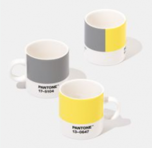
2021 colors of the year


